Reimbursements had nowhere to live.
An employee who spent their own money had no clean way to submit it, and the proof arrived however it arrived. Receipts, screenshots, and scraps of paper got lost or piled up from a dozen people at once.
Reimbursements, for everyone who touches them
inDinero is a full-service accounting platform. For many clients, inDinero's own team keeps the books, runs payroll, and files the taxes. I was the founding and lead product designer, and over seven years I designed the user-facing product end to end. This case study is about the part I owned most directly: reimbursements, built from zero, and the employee, operations, and owner experiences around them. The actual payments ran on a separate payroll system. inDinero handed off to it; I designed inDinero's side of that workflow, not the payroll engine. Where this study touches payroll, it is the people-facing side.
inDinero runs on a model most accounting tools do not: it is full-service. Plenty of clients hand over their finances entirely, and inDinero's own operations team does the work: categorising transactions, running payroll, processing reimbursements, filing taxes. That means the product has an unusual set of users. It is used by business owners, by their employees, and heavily by inDinero's internal team.
I joined as the first designer when the company was tiny. The original 2013 product had been outsourced, so my first job was to take it over: redesign it into something coherent, then build out the user-facing features that turned inDinero into a real platform. Reimbursements was one of the biggest things I built: a feature that did not exist before, sitting inside the Employees & Payroll area, and one that became a real point of organisation for clients.
The thing that shaped every decision here: my users were in the building. inDinero's operations team processed this work all day, so instead of guessing, I could watch them, see where receipts went missing, see where the manual steps piled up, and design specifically to make their work lighter.
Before reimbursements were properly built, the work happened, but it happened the hard way, and the strain landed on three different people.
An employee who spent their own money had no clean way to submit it, and the proof arrived however it arrived. Receipts, screenshots, and scraps of paper got lost or piled up from a dozen people at once.
Every reimbursement meant chasing evidence, reconciling by hand, and keeping track of what could be paid how. Across many client companies, that manual load was the real bottleneck.
For the client paying the bills, it was a black box: who is owed what, what is approved, what is pending. I designed the owner view to fix this, while treating it honestly as designed-for, not measured.
Give employees a dead-simple way to submit a reimbursement and its receipt the moment it happens, so nothing gets lost on the way to the ops team.
Design the processing side around throughput: approve, flag, reconcile across many clients, and reduce mistakes for the people doing it all day.
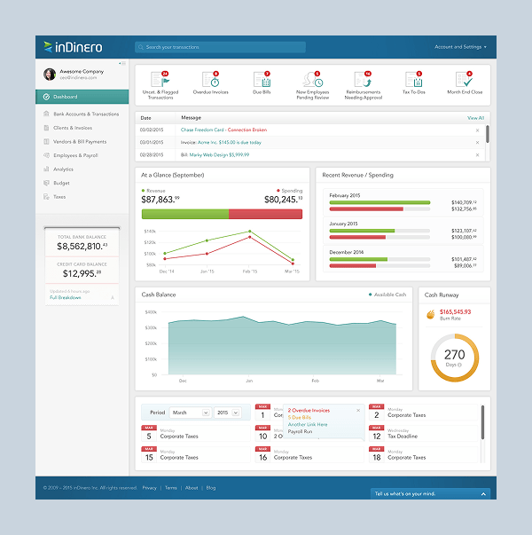
Show what has been spent, who is on the team, and what is pending so the people paying the bills are not staring at a black box.
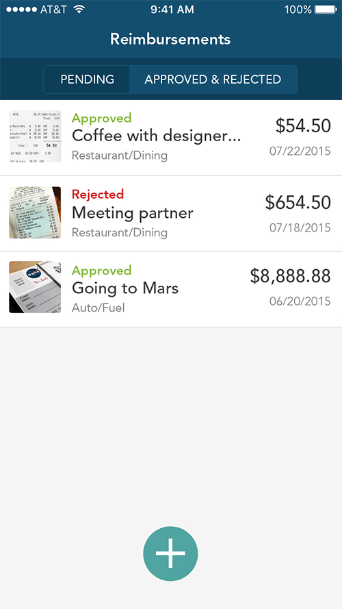
One job shared by three people who never see each other's screens. I designed a view tuned to each.
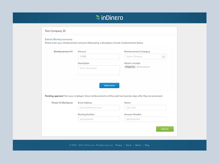
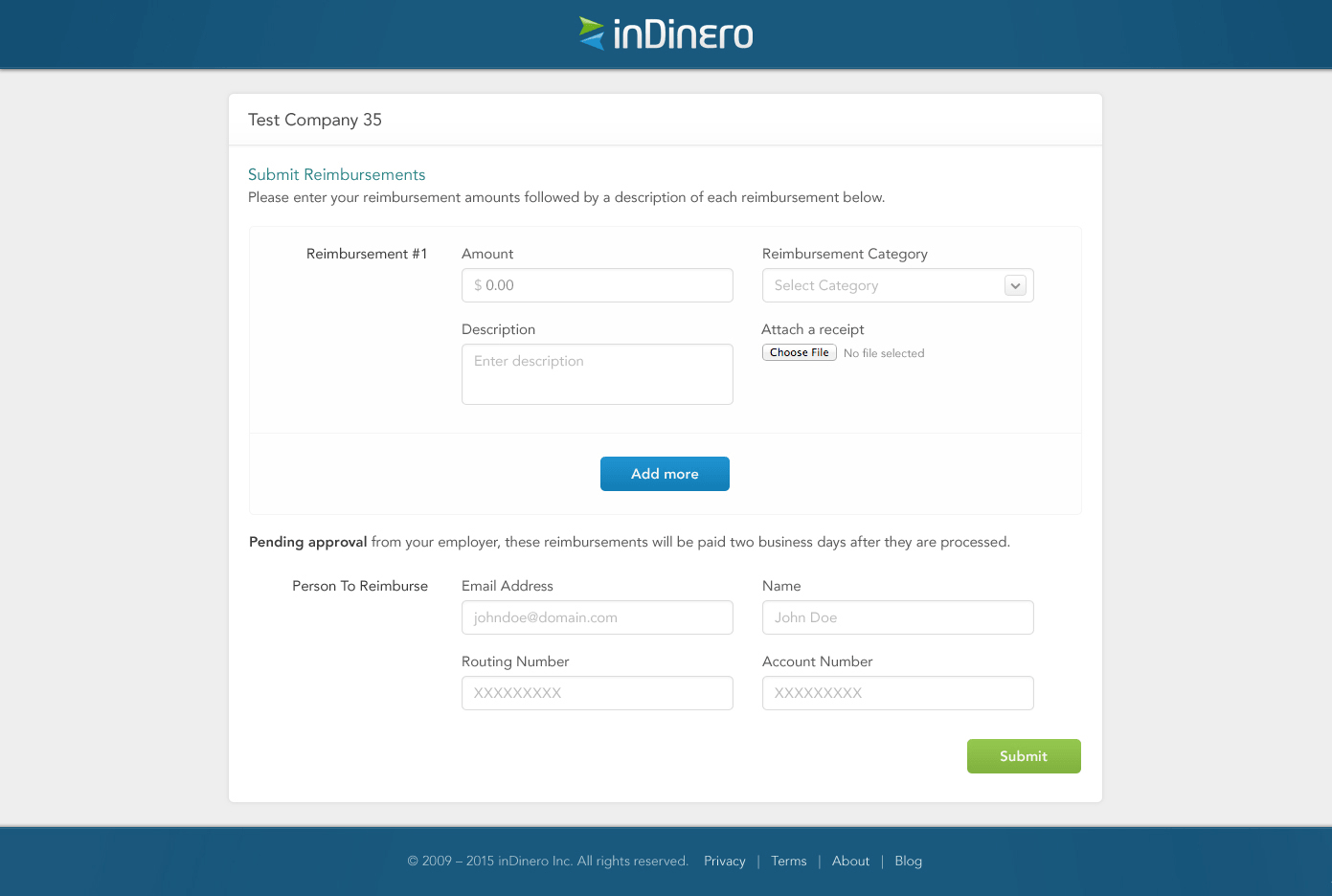
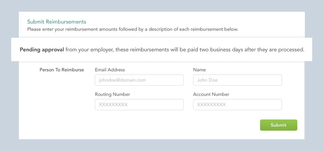
Submitting had two doors: an account-less web link for occasional submitters, and an account-based mobile app for people who submit often. Same simple form underneath both.
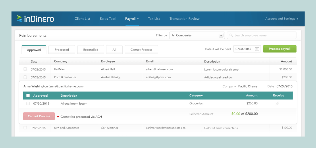
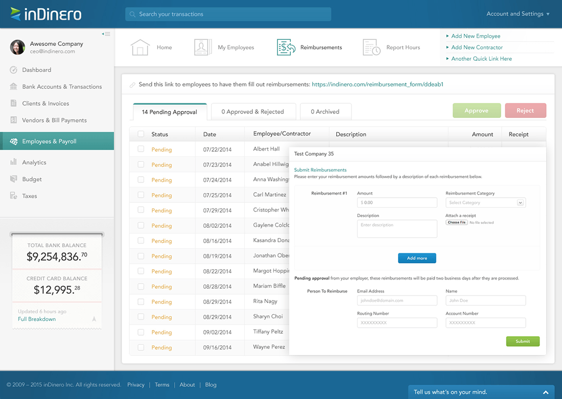
A dense, efficient tool to approve, flag, reconcile, and handle items that cannot be processed, ending in a clean handoff to the separate payroll system.
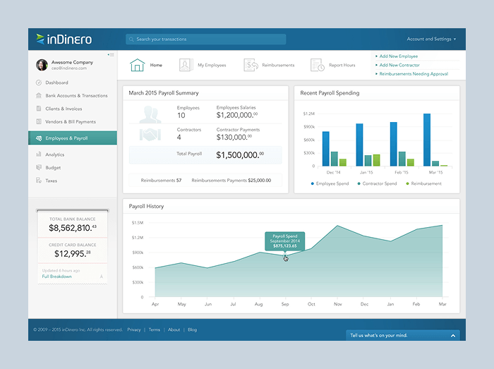
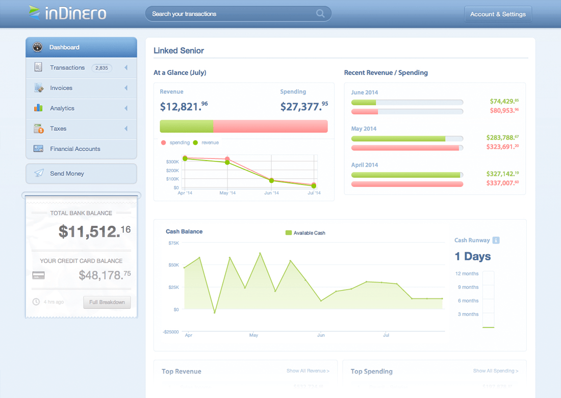
A clear summary of the period's payroll and reimbursements, the team, spending over time, and quick actions for what owners actually self-serve.
 01 - EmployeeSubmits
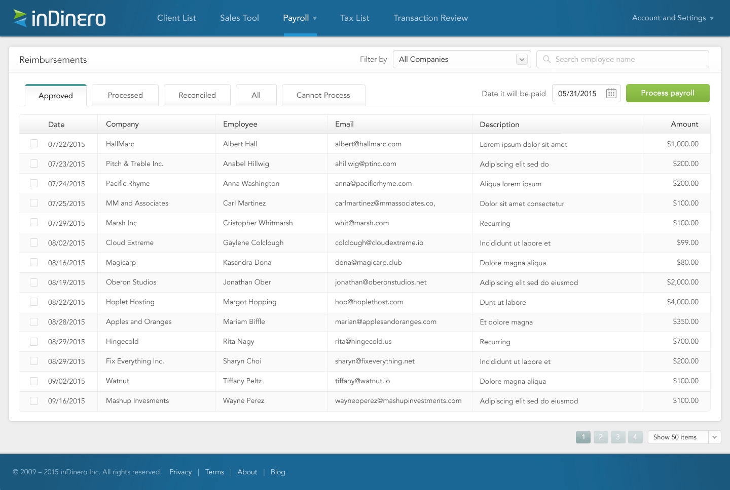 02 - inDinero opsProcesses
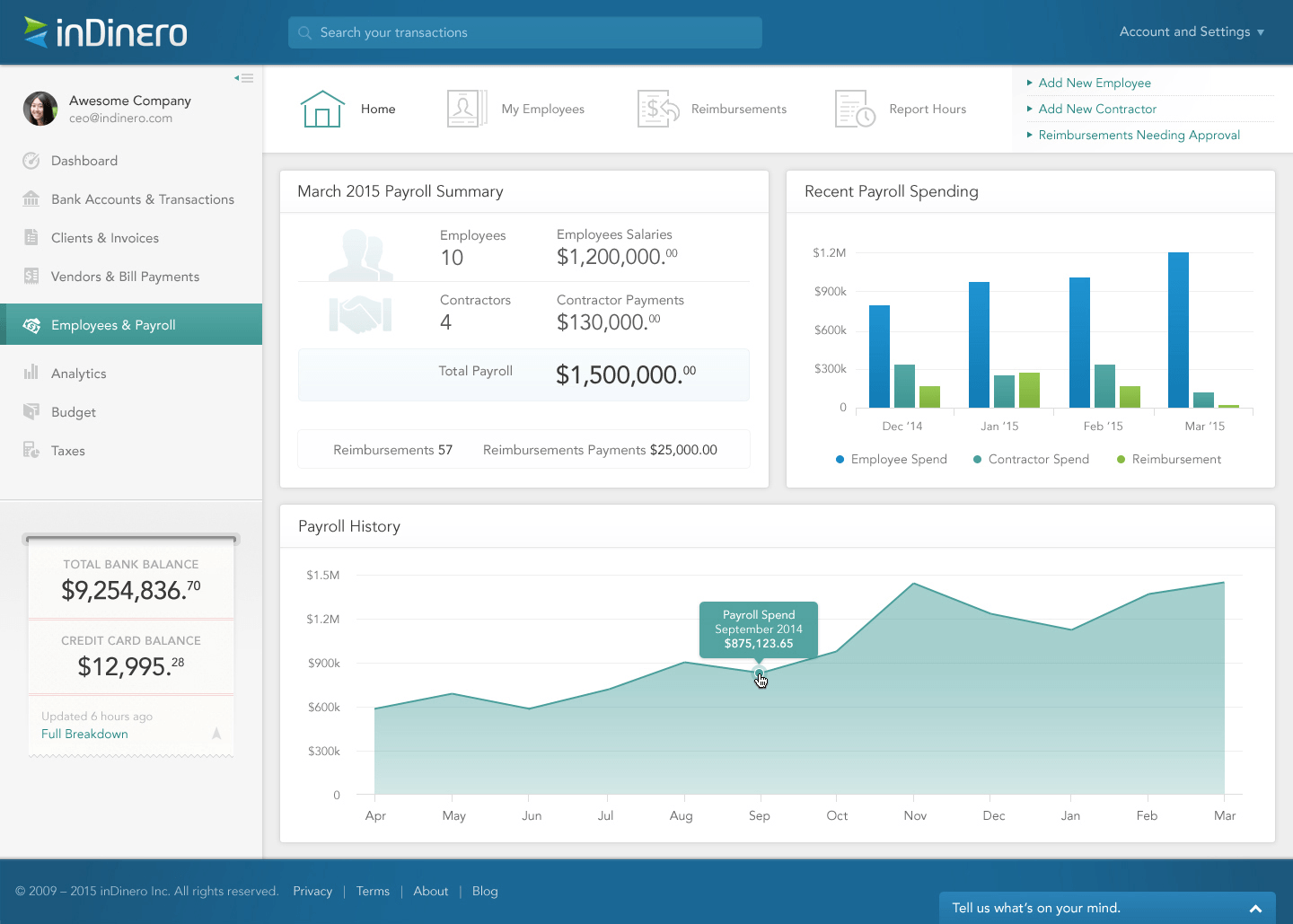 03 - Client adminStays on top
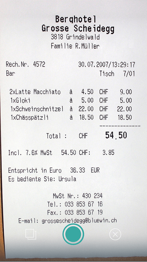
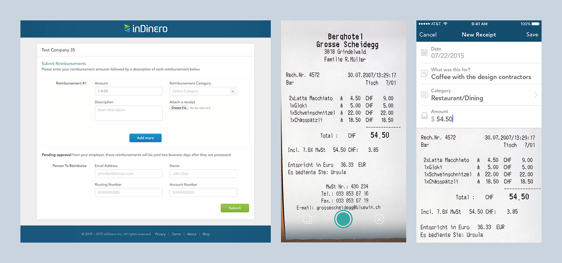
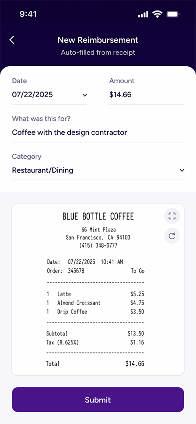
Evidence went missing between spending and the ops team needing the receipt. I kept the account-less web link, added camera-first mobile capture, anchored the receipt under the form, and kept the fields human: Date, What was this for?, Category, Amount.
Most expense tools obsess over the person submitting and forget the person processing. At inDinero, the processor was the bottleneck. I designed the operations side around review, status, exceptions, and a clear handoff to the separate payroll system that actually disbursed the money.
A reimbursement is money someone is owed. Silence after submit breeds follow-up questions. The form explains that the request is pending approval and sets expectations around when it will be paid after processing, mirroring the real disbursement cycle.
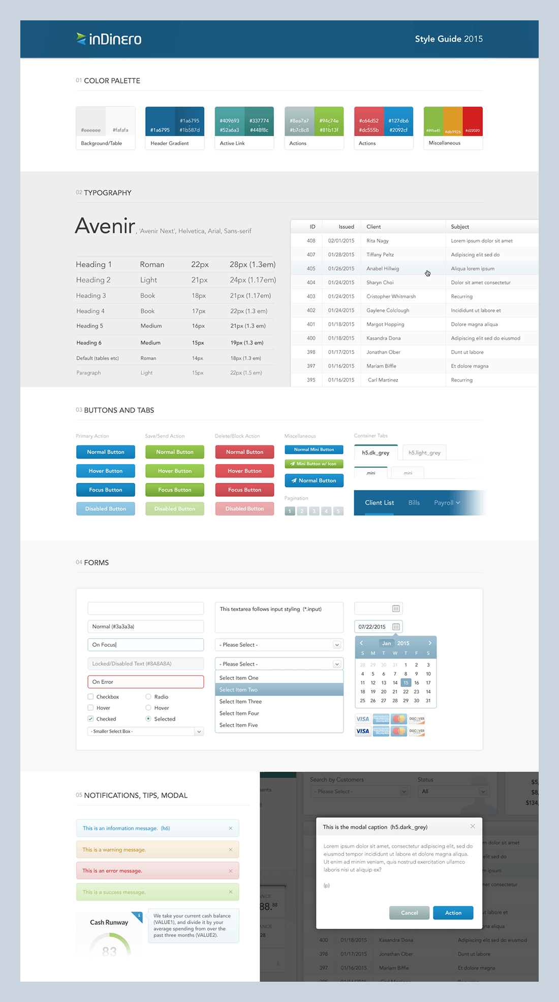
I started as the only designer with two engineers. Over seven years that became a small design team I led and 12+ engineers. A documented style guide and component library kept a growing product feeling like one product.
The constraints were real. I worked from Manila; the product manager and CEO were in San Francisco. Ideas, specs, and new features moved mostly async through chat, documents, sketches, wireframes, and full prototypes for bigger features. Specs often arrived loose, and turning a vague ask into a concrete solution was a big part of the job.
The research advantage was inDinero's own operations team. Rather than guess, I looked at how the data-entry team actually did the work and designed to make it lighter. They were my usability test for almost every reimbursement decision. I ran design solo for the first few years, then brought on two designers and led them while I headed product design.
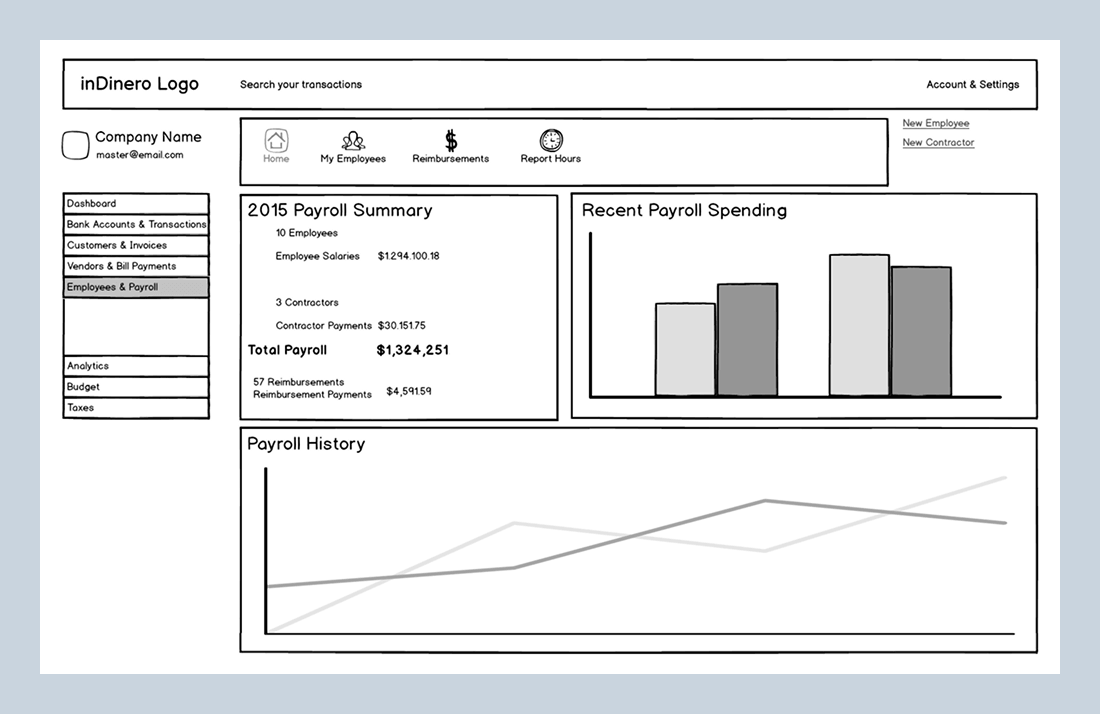
One screen, three points in time: wireframe, shipped 2015 redesign, and a present-day 2026 pass showing where I would take the same surface today.
 Wireframe
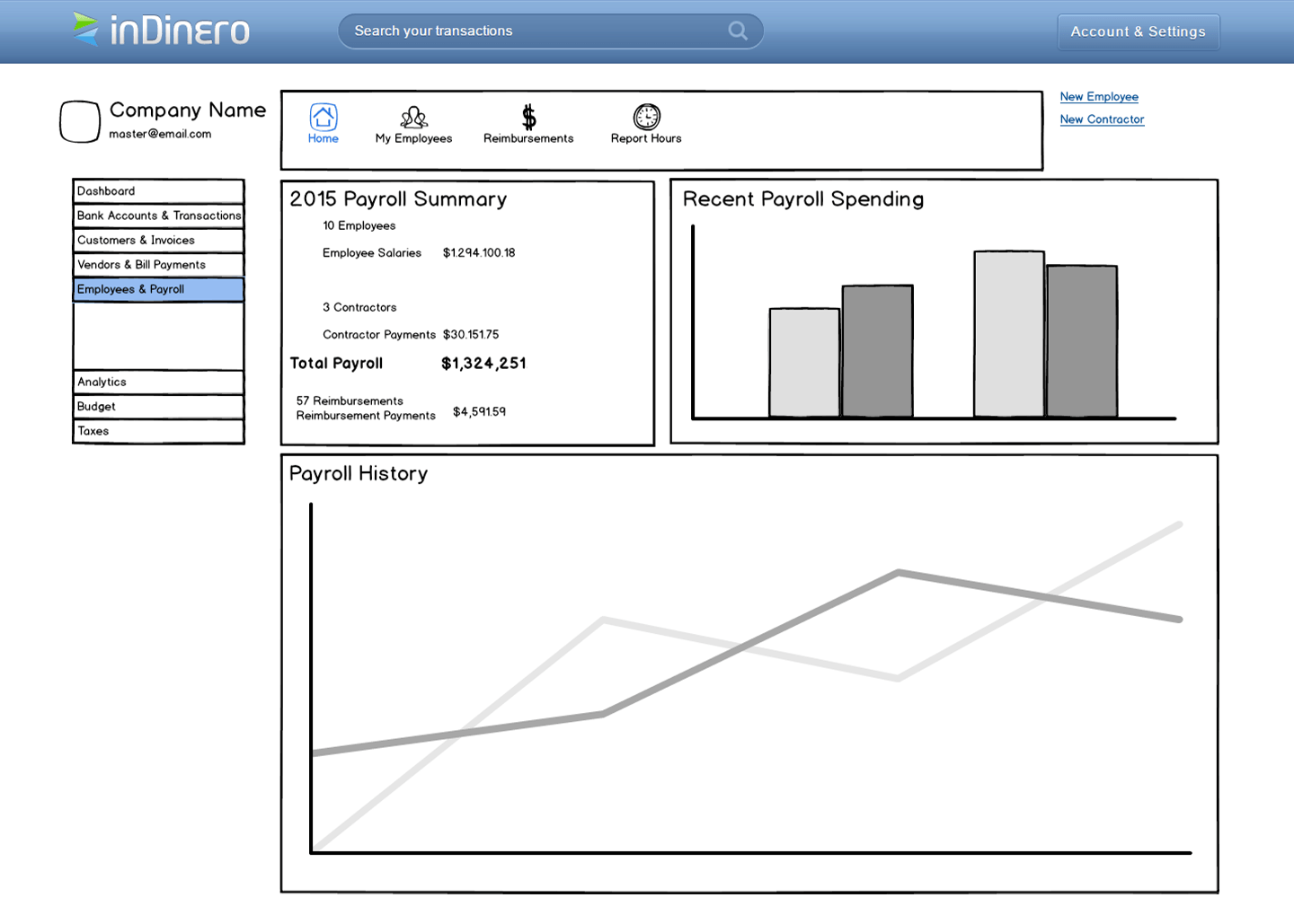
The Employees & Payroll home started with hierarchy and priority, not polish.
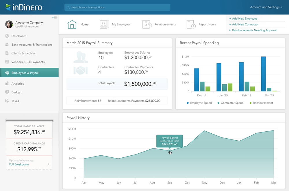
Shipped 2015The outsourced original was rebuilt into a product surface with payroll, spending, and history laid out to scan.
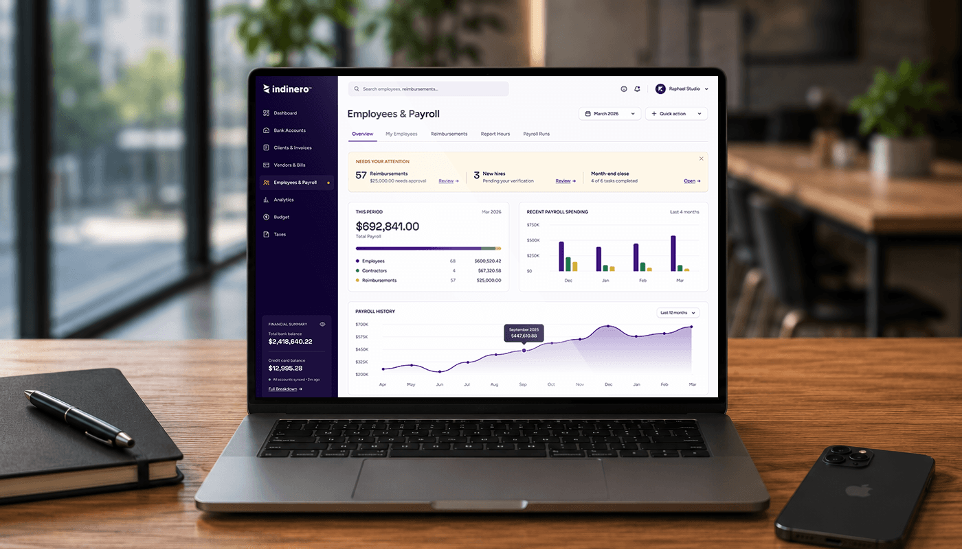
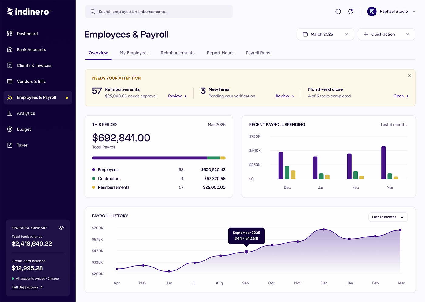 Reimagined 2026
The scattered what-needs-you badges become one attention strip, with payroll and reimbursements broken down at a glance.
Reimbursements across all three people, on web and mobile, plus the surfaces around them. Payroll execution stayed in a separate system; these screens focus on inDinero's side of the workflow.
A single hub for payroll status, reimbursements, employee records, and owner-facing actions.
Mobile, shipped 2015 on iOS 8.
The iOS app gave frequent submitters a direct path to start and track reimbursements from their phone.
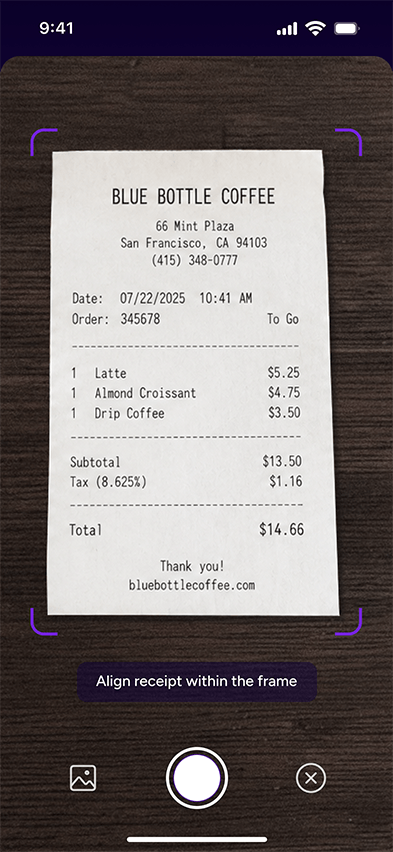
Mobile, today. A 2026 concept pass showing how I would build capture now: camera guidance first, then a cleaner reimbursement record with auto-filled receipt data that stays editable.
No reimbursement feature; employees had no clean way to submit or get paid back. Receipts got lost or piled up from many people at once. The operations team reconciled and chased everything by hand, and owners had little visibility into what was owed, approved, or pending.
Employees submit in a few taps and attach the receipt at the source, including by phone. The operations team processes on a tool built for their workflow, owners get a legible view of the period, and reimbursements became a real, paid part of the service.
The lesson that stuck with me from inDinero is that the most valuable user is often the one nobody designs for. Everyone builds for the person submitting; almost no one builds for the person processing. Because my users were inside the company, I could see that the real leverage was on the operations side, and designing for them is what made reimbursements lighter for everyone above them.
Seven years on one product also taught me the long game: that a design system is not overhead, it is what lets a small team keep a growing product coherent, and that the best features get revisited, not finished. The 2026 screen is a small piece of that instinct: never quite leaving it alone.
Building something that needs a clear, trustworthy product experience? I'd love to hear about it.