ZinoPay - Client work (rebranded)

A clearer crypto payment experience

ZinoPay merchant dashboard

ZinoPay is a mobile payment app for merchants who get paid in crypto. I designed the whole journey end to end: a merchant creates a payment request, their customer pays it in a few taps, the funds clear on-chain, and the money settles into a payout. The aim was to make crypto payments feel as ordinary and reassuring as tapping a card.

  • RoleProduct Designer (end-to-end)
  • ScopeUX/UI Design, Mobile App, Product Flow
  • PlatformiOS, Android
  • Project TypeClient engagement, rebranded and refreshed

Overview

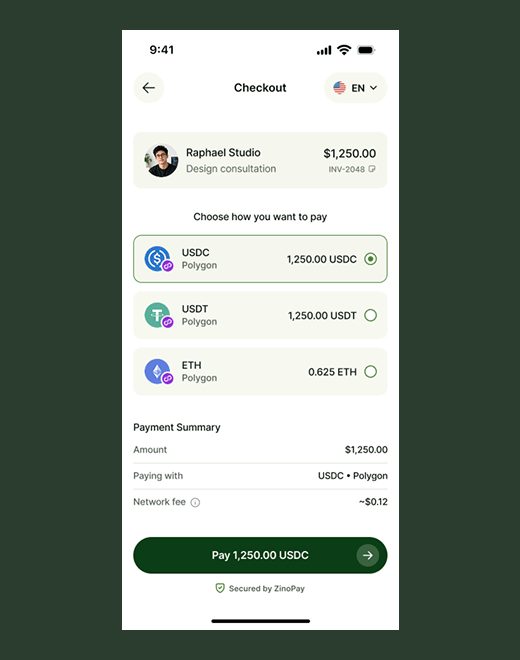
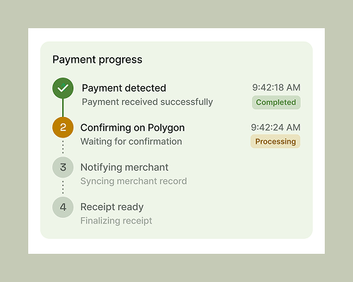
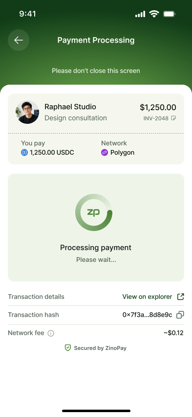
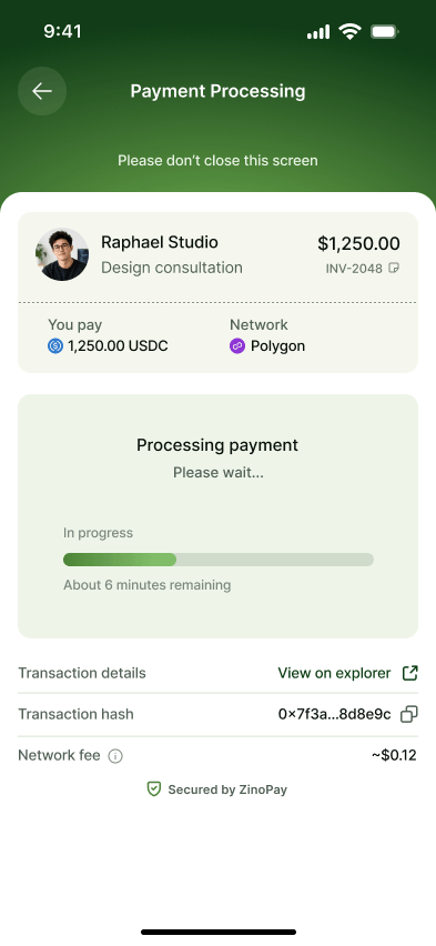
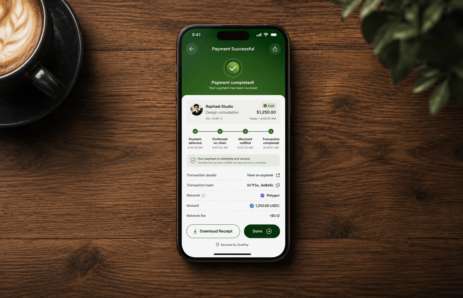
Most crypto payment tools are still built for people who already speak crypto. For a merchant who just wants to invoice a client and get paid, that means wallets, gas fees, networks, and confirmation states thrown at them with almost no explanation, and a nagging "did that actually go through?" at every step.

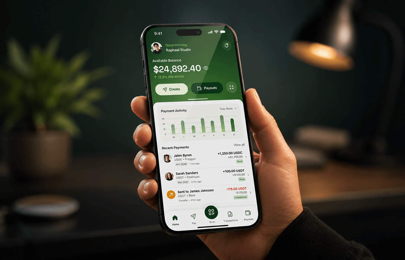
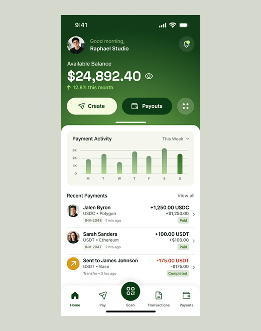
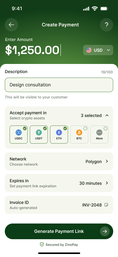
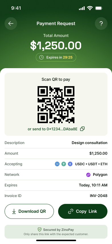
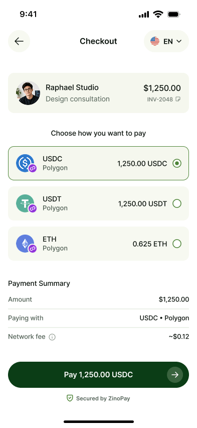
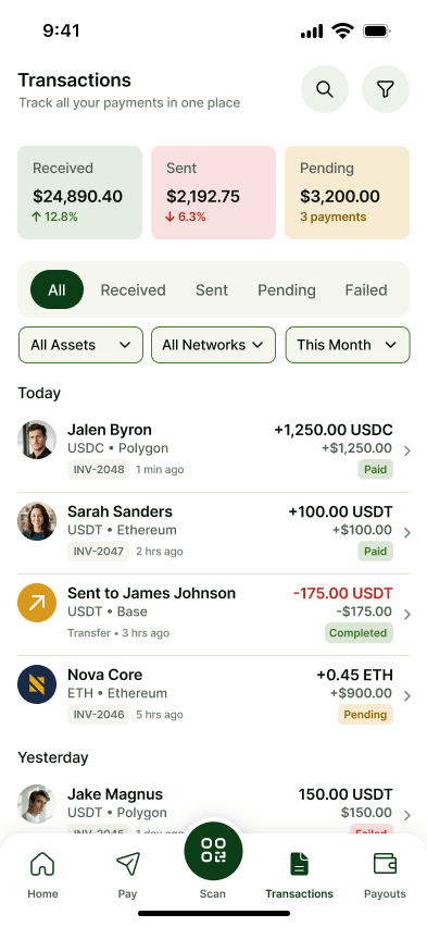
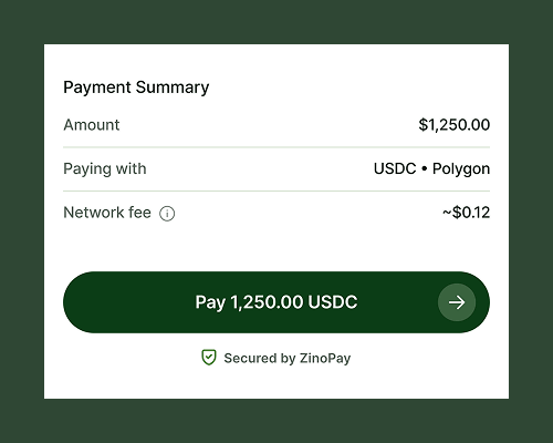
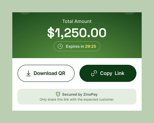
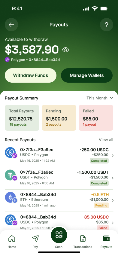
ZinoPay is my take on what a crypto payment app could feel like if it borrowed the calm, predictable rhythm of something like Stripe or Wise. It is really two connected products in one: a merchant side for creating payments, tracking them, and managing payouts, and a customer side for paying a request in a few taps, no account required.

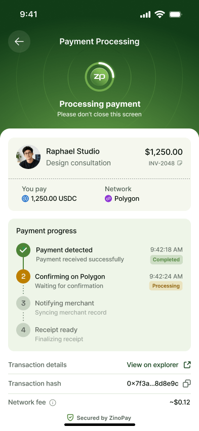
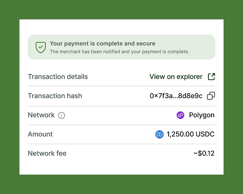
I designed the full flow (dashboard, payment creation, the shareable checkout, on-chain confirmation, transaction history, and payouts) with a single throughline: at every screen, you should know exactly what is happening, what is next, and that your money is safe.

ZinoPay overview screen one ZinoPay overview screen two

Problem

Crypto can move money in seconds, but the experience around it still makes people nervous. The hard part is not the transaction. It is the uncertainty wrapped around it. I framed the problem around the two people who feel that uncertainty most.

The customer hesitates.

A first-time payer faces wallet prompts, an unfamiliar network, and a gas fee that appears out of nowhere. With no clear sense of what they are paying or whether it worked, the safe choice is often to abandon the payment entirely.

The merchant is flying blind.

Once a payment is sent, the merchant needs more than "pending." They need to know what cleared, what is stuck, what settled, and what is ready to withdraw, without opening a block explorer to find out.

Goals

I set three goals to keep the design honest, each pointed at a specific moment of doubt.

01

Make status obvious.

Surface what is happening in plain language at every step, so neither side has to guess whether a payment went through.

02

Build confidence before the commit.

Show the exact amount, asset, network, and fee before anyone confirms. No surprises after the point of no return.

03

Give merchants a real ledger.

Turn raw on-chain activity into a clear operational view: payments tracked, history searchable, payouts managed in one place.

Key Flows

The product spans both sides of a single payment. The flow follows the money from request to settlement.

Create and share

The merchant sets an amount, chooses which assets to accept and on which network, then generates a QR code and link with a live expiry countdown. One customer, one payment.

Pay, confirm, reconcile

The customer opens the link, sees the merchant and exact amount, chooses an asset, and pays. A step-by-step timeline tracks the payment from detected to confirmed on-chain to receipt ready, then the payment feeds into merchant history and payouts.

Create payment01 - MerchantCreate
Payment link generated02 - MerchantShare
Customer checkout03 - CustomerPay
Payment processing04 - BothConfirm
Transactions05 - MerchantReconcile

Design Decisions

Show the fee before "Pay," not after

Hidden network fees are the most common reason a first-time crypto payer bails at the last second. I surfaced the exact fee in the payment summary, next to the Pay button, so a scary surprise becomes a tiny, expected line item.

Payment summary and Pay button

A timeline, not a spinner

On-chain confirmation can take anywhere from ten seconds to a minute. A labelled four-step timeline with timestamps tells a clear story from confirmation to receipt, so the wait feels safe instead of frozen.

Payment progress timeline

Plain language over raw chain data

Outcomes come first: "Payment completed," "Merchant notified," and "Receipt ready." Hashes and "View on explorer" sit underneath for users who want proof, without alienating everyone else.

Transaction details and explorer link

Expiring, single-customer payment links

A reusable payment link is both a security and accounting hazard. I used an auto-expiring link with a visible countdown, framed for one expected customer, so security shows up as a visible feature instead of buried fine print.

Expiring payment link details

Exploration

The confirmation screen went through the most iteration because it carries the most risk. I explored three directions before landing on the timeline.

Minimal spinner explorationDirection A

Minimal spinner

Clean, but it left people staring at an ambiguous loader with no sense of progress or end.

Progress bar explorationDirection B

Single progress bar

Better motion, but a bar promises a predictable duration that on-chain confirmation cannot keep.

Chosen step timelineDirection C

Labelled step timeline

Each phase named, timestamped, and checked off as it completes. The only option that explains what is happening, not just that something is.

Before / After

ZinoPay started from the friction in the typical crypto payment flow. This is what changed, described as design outcomes, not invented metrics.

Before

Network fees surface late, confirmation is a single spinner, status is communicated in hashes and raw chain states, and merchants track payments by hopping between a wallet and a block explorer.

After

The exact fee and amount are visible before Pay, a four-step timeline narrates the wait, plain-language status leads, and merchants get a single dashboard for payments, history, and payouts.

Reflection

The thing I kept coming back to is that crypto's hardest problem here is not speed or cost. It is trust at the moment of waiting. Most of my best decisions came from asking "what is the person staring at this screen actually worried about right now?" and answering it directly, usually with a word rather than a spinner.

If I took this further, the next step would be putting the checkout in front of real first-time payers. I would want to know whether the fee-and-amount summary reassures or overwhelms, and whether the four-step timeline actually lowers the urge to close the app mid-payment, or just gives people more to stare at. Those are answers a prototype cannot give me. Only people can.

ZinoPay closing payment success screen

I'm available for new opportunities

Building something that needs a clear, trustworthy product experience? I'd love to hear about it.